
A call-to-action (CTA) is an element (usually a clickable button) that encourages users to complete the desired action (i.e., phone call, CRM-integrated service booking, form submission, email subscription, etc.).
For plumbers, a CTA commonly urges website visitors to schedule services or call the company phone number.
This guide explains why calls to action are integral to website conversions and how to integrate them into your plumbing business website.
Key Takeaways
- A call-to-action (CTA) is a clickable element, usually a button, that prompts a visitor to complete a specific action such as calling, booking, or subscribing.
- This guide covers four CTA approaches: free offers, urgency messaging, personalization, and color contrast.
- Fake urgency and generic personalization are the two most common ways a CTA backfires and erodes visitor trust.
- Mobile visitors researching an emergency plumbing issue respond best to a click-to-call CTA placed above the fold.
- More than half of consumers now visit a business’s website right after reading a positive review, so the CTA needs to be clear the moment they arrive.

Why CTA Placement Matters Before a Visitor Reads Any Copy
More than half of consumers (54%) visit a business’s website after a positive review, up from 32% in 2019, according to BrightLocal’s 2026 Local Consumer Review Survey. That means the CTA has to be visible and unambiguous the moment someone lands on the page instead of buried after several paragraphs of company history.
A CTA is also treated as a must-have element on service-area pages by current search guidance. Every section below assumes the CTA is planned alongside the page content from the start rather than inserted aimlessly onto all pages.
This matters more for plumbing than for many other local services. A visitor comparing landscaping companies is usually planning weeks ahead. A visitor searching for a plumber has often already decided they need service today, which compresses the window a CTA has to work in from days down to seconds.
That compressed window is also why a single CTA style rarely covers every visitor a plumbing site attracts. The same homepage may need to serve someone comparing quotes for a bathroom remodel next month and someone with water actively spreading across their kitchen floor right now.
Building the CTA strategy around that range, rather than a single default button, is the difference between a page that converts its highest-intent traffic and one that only converts visitors who were already planning to call.
Four CTA Approaches for Plumbing Websites
Most plumbing websites have a CTA, whether the owner planned it or not. Well-crafted CTAs usually separate a company that converts traffic from one that generates visits without generating calls.
Even companies with strong, consistent traffic can underperform on leads if the CTA itself is an afterthought. The four approaches below are starting points to test against your own traffic and shouldn’t be treated as fixed rules to apply identically on every page.
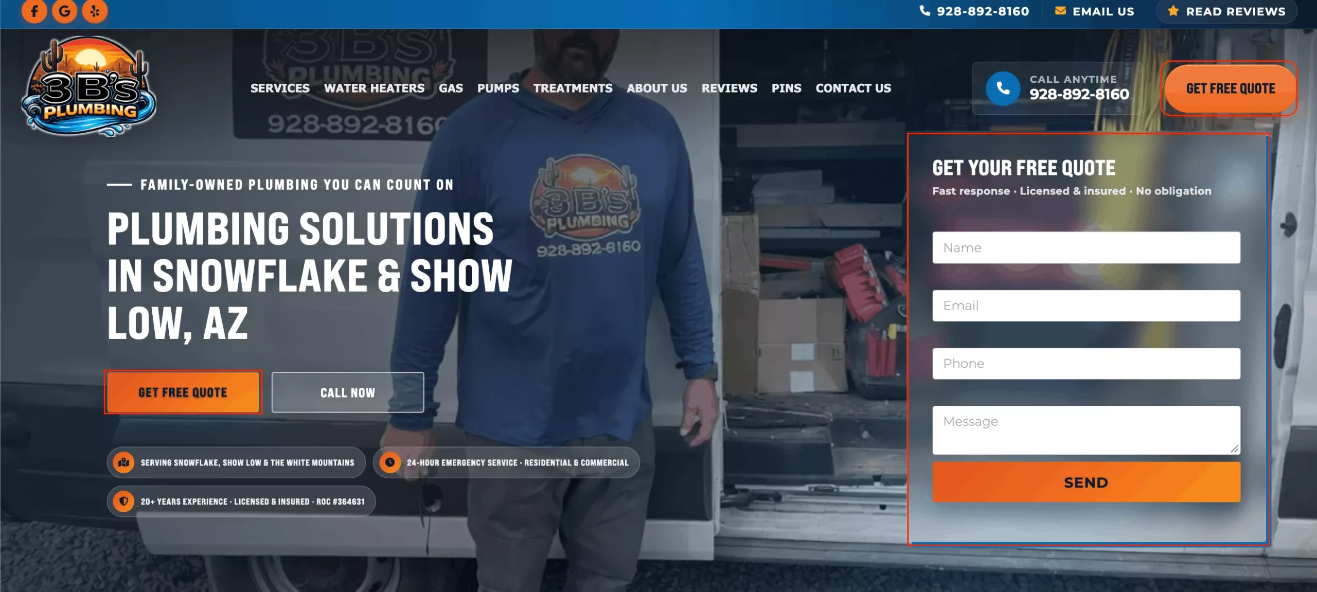
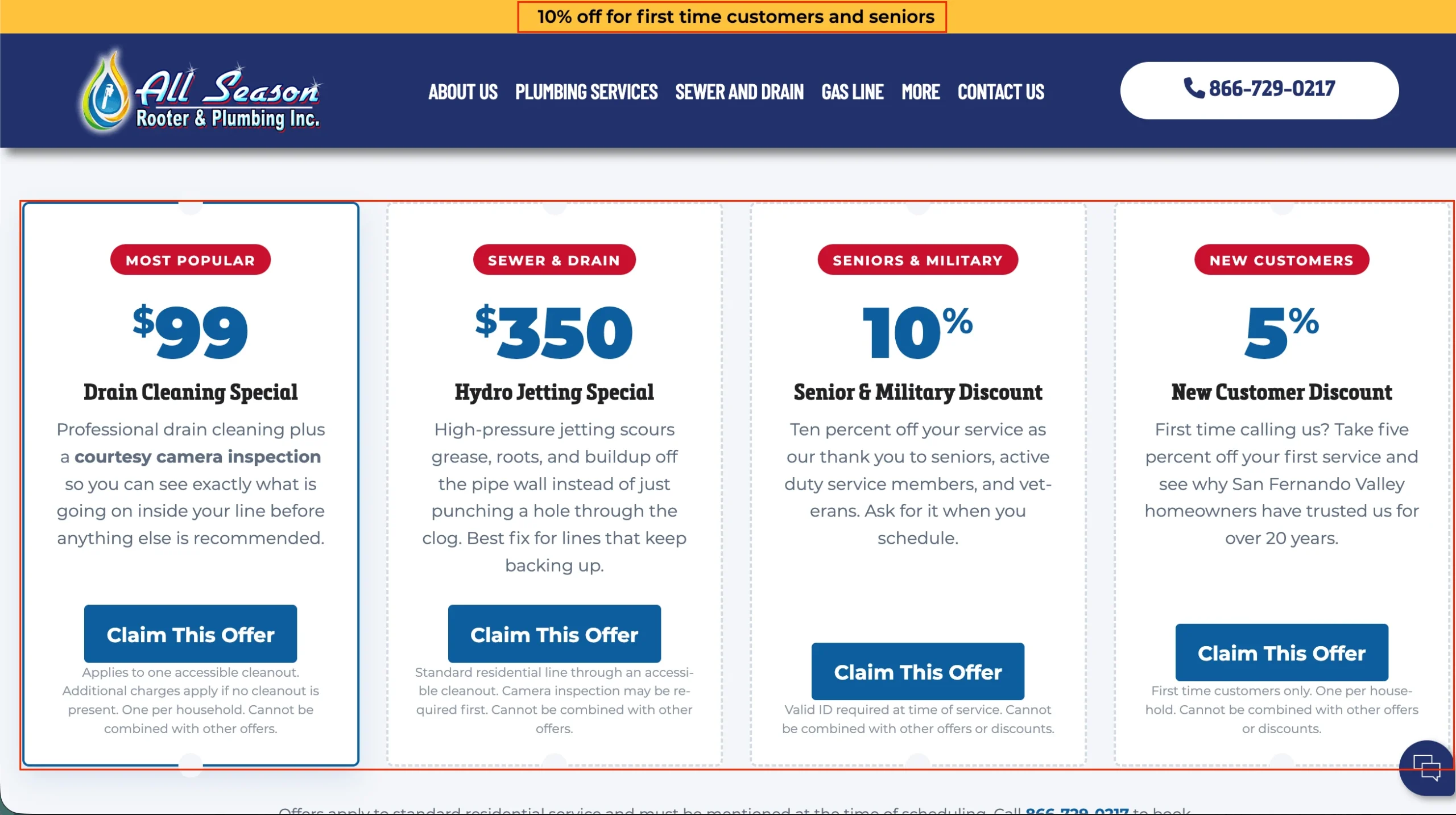
1) Free-Offer CTAs
Free offers are among the most reliably attention-getting incentives Plumbing Webmasters has observed across plumbing client campaigns.
A discount for first-time customers, or a complimentary inspection bundled with a paid service call, gives a visitor an immediate reason to act instead of bookmarking the page for later.
The offer should be scoped to a specific service rather than a generic “free stuff” claim. A free inspection tied to a named issue, such as a water heater checkup, reads as more credible than an unscoped giveaway, and it also sets the visitor’s expectations correctly before they call.
Examples:
- Call (Phone Number) To Claim Your Free Plumbing Inspection
- Claim Your Free Camera Inspection with Any Main Line Cleaning
- Get A Free Quote on Your Water Heater Repair
2) Urgency CTAs
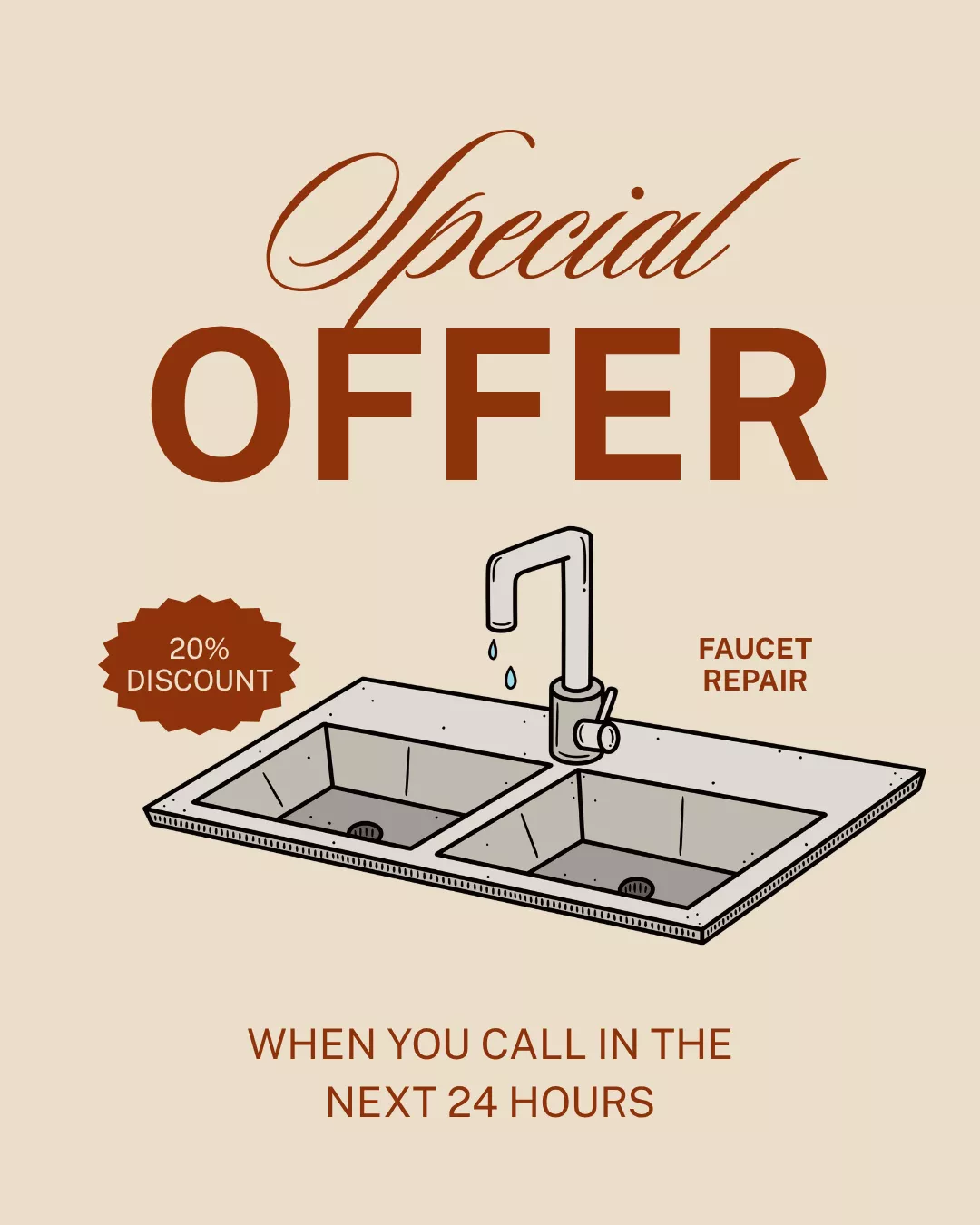
A real deadline gives a visitor a reason to act now instead of putting off the decision. Urgency only works, though, when the deadline is genuine.
A countdown that resets for every new visitor, or a discount that never actually expires, is one of the most common ways an urgency CTA backfires: once a visitor notices the deadline isn’t real, it undermines trust in the rest of the page.
Align any time-limited offer to a window you can actually honor before publishing it. If a discount runs for 12 hours, the business needs an operational plan for what happens when someone calls on hour 13 and expects the same rate.
A CTA that creates a problem for the front desk to explain away isn’t actually converting visitors into customers; it’s damaging brand perception and encouraging negative feedback.
Examples:
- Book Your Plumber Within The Next 12 Hours For a 25% Discount
- Call (Phone Number) In The Next 24 Hours For a 50% Discount
- Subscribe Within 6 Hours For a 20% Off Coupon
3) Personalized CTAs
A CTA aligned with a visitor’s specific situation, such as the exact fixture or room mentioned in their search, sets a clearer expectation than a generic “Contact Us” button.
The goal is to match the button language to what the visitor is already looking for, rather than defaulting to a one-size-fits-all message across every page on the site.
This requires the CTA to match the page it sits on. For example, a CTA referencing garbage disposal repair belongs on the garbage disposal service page. When the button language and the page content line up, the visitor doesn’t have to translate a generic offer into their specific problem.
Examples:
- Switching to a Tankless Water Heater? Book Your Conversion Today
- Claim YOUR $49.99 Drain Cleaning Now
- We Can Fix YOUR Broken Garbage Disposal; Book Now

4) Color and Contrast
No single button color converts best across every plumbing website. Contrast against the surrounding page, and consistency with the site’s existing brand palette, determine whether a CTA button actually gets noticed, more than which specific hue was chosen.
A bright button on a busy, high-contrast page can still get lost, while a more muted color on a clean, minimal layout can stand out clearly.
Before locking in a color, work through this checklist:
- Test contrast over color alone: a button needs to visually separate from its background regardless of hue.
- Match the site’s existing palette: a color that clashes with the established brand scheme can undercut trust rather than build it.
- Confirm the color renders correctly on both mobile and desktop, since some colors lose contrast on smaller screens or under bright outdoor light, which matters for a visitor searching from a job site or driveway.
- Track click-through by variant for a defined period before committing to one option long-term, rather than assuming a color choice will hold up without checking it against your own traffic.
CTA Approach Comparison
| Approach | Best Fit | Key Caveat |
|---|---|---|
| Free-Offer | First-time customers, low-commitment services | Needs a genuine, specific offer instead of a vague “free stuff” claim |
| Urgency | Time-sensitive repairs, seasonal promotions | Backfires if the deadline resets or isn’t real |
| Personalized | Visitors arriving from a specific service-page search | Requires matching the message to search intent rather than a generic greeting |
| Color/Contrast | Every CTA button, tested per site | No color wins universally; contrast and brand consistency matter more than hue |
| Button vs. Text Link | Buttons for primary actions (call, book); text links for secondary reading | Overusing buttons on one page dilutes the visual priority of the primary action |
CTAs for Mobile and Emergency Plumbing Visitors
Local business pages should make calling or getting directions effortless, according to Search Engine Land’s current guidance on local contact pages, since plumbing traffic skews heavily toward mobile visitors searching under time pressure.
A click-to-call button placed above the fold answers that need directly. A lengthy contact form buried below several sections of copy adds friction for someone standing next to an active leak.
A Plumbing Webmasters case study of a Michigan plumber shows how clear header calls-to-action, along with other digital marketing initiatives, contributed to a nearly 3x revenue increase in just 7 months.
For a shop testing one CTA change at a time on a limited budget, the click-to-call button is the highest-priority place to start. It requires no design work beyond linking a phone number, and it matches the intent of the highest-urgency visitor segment on the site.
For 24-hour or emergency plumbing services specifically, the CTA should lead with the phone number rather than a generic “Contact Us” label. A visitor in an active emergency is deciding whether to call immediately, so the fastest path to a phone call should be the default.
Routine, non-emergency services can afford a slower CTA. A visitor researching a bathroom remodel or a planned water heater replacement is often comparing multiple companies over several days, so a form that captures their information for a follow-up call fits that decision timeline better than a hard push toward an immediate call.
When These CTA Tactics Don’t Work
- Fake urgency: a discount deadline that resets for every visitor, or never actually expires, undermines trust once a visitor notices, and it can make every other claim on the page look less credible by association.
- Generic personalization: a CTA that claims to speak “directly to you” on a page with no connection to what the visitor actually searched for reads as templated rather than personal.
- Buried CTAs: a call-to-action placed only at the bottom of a long page misses visitors who decide within the first few seconds, which is common for emergency service searches.
- Color without contrast: choosing a color because it’s considered a best practice, even when it blends into the page’s existing palette, defeats the purpose.
- One CTA for every visitor: a single generic “Contact Us” button ignores the difference between a visitor comparing quotes over several days and a visitor with an active leak in the next room.
- Mismatched offer and audience: a free-offer CTA aimed at first-time customers loses relevance on a page built for repeat maintenance clients who already have an account with the company.
Testing CTAs Instead of Guessing
None of the four approaches above should be treated as a permanent setting. The most reliable way to know whether a free offer, an urgency message, a personalized button, or a specific color is working is to test it against the traffic a specific site actually gets, rather than adopting a tactic because it worked somewhere else.
A practical testing sequence looks like this:
- Change one variable at a time. Testing a new color and new copy simultaneously makes it impossible to know which change drove the result.
- Give each version enough time to collect a meaningful number of visitors before comparing results, rather than judging after a handful of clicks.
- Track calls and form submissions in addition to clicks. A click on a CTA button isn’t the same as a completed call or booking, and the gap between the two can reveal a problem elsewhere in the funnel.
- Revisit the winning version periodically. A CTA that performs well during one season, such as an emergency-focused message during a cold snap, may not be the right default the rest of the year.
Final Thoughts on Plumbing Calls to Action
A plumbing website’s CTA strategy works best when it’s tested rather than assumed. What converts a budget-conscious visitor comparing quotes is rarely the same button, copy, or placement that converts someone with a burst pipe at two in the morning.
Treating free offers, urgency, personalization, and color as starting hypotheses instead of fixed rules keeps the page adaptable as traffic and visitor intent shift over time.
Author: Nolen Walker
Nolen Walker is the founder of Plumbing Webmasters and the creator of DataPins™, a Local SEO platform for plumbing companies. He has over 16 years of experience helping plumbing businesses grow through organic search, Google Maps, and AI-driven visibility.
Nolen is the author of A Complete SEO Guide for the Plumbing Small Business Owner. He also hosts The Plumbing SEO Podcast on Spotify.